
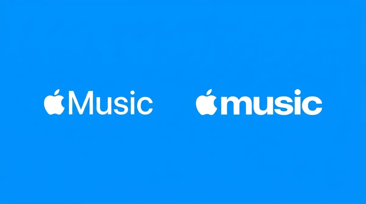


Apple Music Debuts Chunky New Logo In Software Betas
The Cupertino hardware giant is quietly replacing its familiar music streaming icon with a bolder, lowercase design across its upcoming mobile and desktop operating system updates.
Inioluwa Ademidun | 6 Oct. 2026, 12:47 PM · 2 min read

Software design changes at massive technology companies rarely happen by accident. Every pixel is debated endlessly before reaching the public. Apple is currently preparing to roll out a subtle but highly visible brand adjustment to one of its most lucrative digital services. Code hunters digging through the latest iOS 27.2 and macOS 27.2 developer betas discovered a brand new logo for Apple Music. The updated design ditches the traditional capitalization in favor of a bolder, chunky lowercase aesthetic.
The new visual identity did not appear completely out of nowhere. The company briefly displayed the exact same chunky lettering last month during the announcement of the Apple Music Hall, a physical concert venue located at the Battersea Power Station in London. At the time, industry watchers assumed the text was just a unique marketing graphic specifically designed for the concert venue. The appearance of the logo deep inside the core operating system code proves that the company intends to apply the visual overhaul across the entire global application.
Modifying the core interface is a standard tactic used to refresh aging applications. The software division constantly tweaks the visual presentation to keep the ecosystem feeling modern. We noticed this exact commitment to subtle visual refinement when Google blended its own software design languages to match modern mobile aesthetics earlier this year. A clean, updated logo subtly signals to the user that the underlying service is actively maintained and worth the monthly subscription fee.
Timing the Release
Currently, the public website and the browser-based web player still display the older, thinner branding. The transition to the new lowercase design will likely happen simultaneously across all digital surfaces when the final software updates push out to global consumers later this month. This rollout schedule aligns perfectly with the highly anticipated retail launch of the folding iPhone Duo. Releasing fresh operating system visuals alongside a brand new hardware category guarantees maximum media coverage.
The audio streaming sector is fiercely competitive, and companies must constantly fight to justify their subscription prices. While a new logo does not alter the actual audio quality or expand the music library, it unifies the brand presentation across televisions, smartwatches, and laptops. As the Cupertino company expands its smart home audio hardware, having a highly legible, thick font ensures the logo looks perfect on tiny digital screens and massive billboards alike.
Read More on TechRobust:

Inioluwa Ademidun
 LinkedIn
Inioluwa Ademidun
Expertise:African Tech Ecosystem, Early-Stage Startups, Emerging Market Dynamics, Venture Capital & Tech Reporting, Product Management
Award:TechRobust Contributor of the Year 2025
Inioluwa is a Senior Product Manager by day and an investigative technology reporter by night, bridging the gap between scalable software architecture and high-impact journalism. She delivers deep-dive analysis on venture-backed founders, regulatory shifts, and grassroots tech ecosystems across Africa and global emerging markets.