


Google Blends Material 3 Expressive and Liquid Glass on iOS
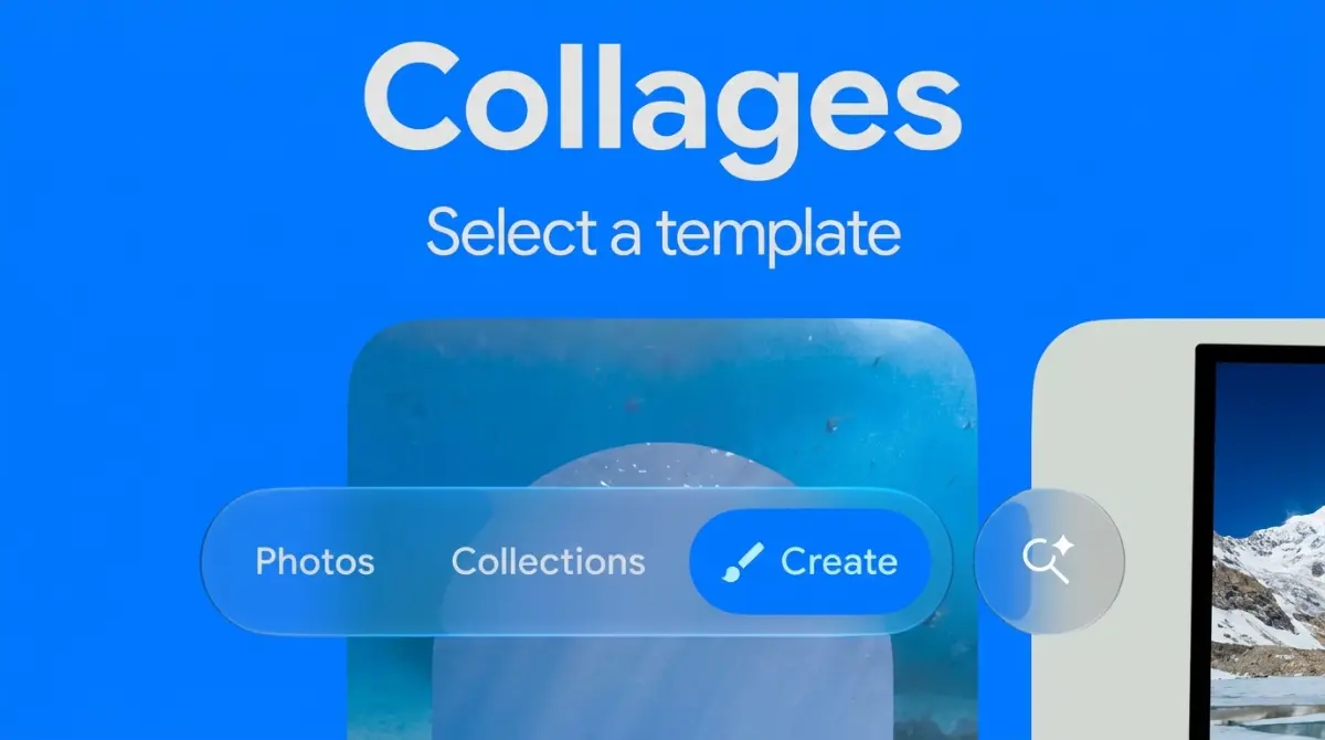
Google is updating its iPhone applications by merging the translucent Liquid Glass aesthetic of iOS 26 with its highly customizable Material 3 Expressive design language.
Umar Abubakar | 26 Sept. 2026 · 8 min read

Google is rolling out a massive visual overhaul across its entire catalog of iOS applications. The software giant decided to merge two completely different design philosophies into a single interface. Users opening Gmail, Google Maps, or the standard Google search application on an iPhone will now see a hybrid layout. The engineering team successfully combined Apple's translucent Liquid Glass aesthetic with Google's own highly customizable Material 3 Expressive design language. This decision completely changes how these applications look and feel on Apple hardware, moving away from rigid, solid backgrounds toward a softer, highly reactive visual experience.
To understand the weight of this visual update, one must look at the strict boundaries technology companies usually place around their software aesthetics. Historically, Google preferred its applications to look identical regardless of the device running them. An application on an Android phone looked exactly like the same application on an iPhone. Meanwhile, Apple strongly prefers developers to use native components so every application feels like a natural extension of the operating system. By blending these two distinct visual systems, Google is attempting to satisfy both requirements simultaneously. The applications retain the familiar colorful identity of a Google product while adopting the physical rendering properties expected by an Apple user.
The Mechanics of Translucent Interfacing
Apple introduced Liquid Glass during the massive iOS 26 rollout last year. The Cupertino company designed this visual element to act as a highly reactive functional layer. Instead of drawing a solid gray or white box at the bottom of the screen to hold navigation buttons, the operating system renders a frosted, translucent material. When a user scrolls down a webpage or reads a long email, the text and images slide underneath this navigation bar, blurring and refracting through the glass-like surface. The material actively adapts to light and dark environments, pulling color directly from the content passing beneath it to create a sense of physical depth on a flat glass screen.
By adopting this precise rendering technique, Google immediately makes its applications feel native to the iPhone. When an iPhone user opens the updated Gmail application, the bottom navigation bar and the top search field no longer block the emails with a solid wall of white pixels. The interface uses the Liquid Glass rendering engine, allowing the underlying inbox content to blur smoothly behind the controls. This matches the exact behavior seen across native Apple software, proving that Google is willing to compromise its strict internal design rules to provide a better physical interaction for external hardware users. We observed similar visual modernizations recently when covering how Apple sped up thirty different system areas using updated iOS rendering techniques.
Injecting Brand Identity with Color and Shape
While the translucent layers belong entirely to Apple, the actual buttons, typography, and color schemes belong strictly to Google. The Material 3 Expressive system represents the latest evolution of the visual language originally launched on Android devices. This system relies heavily on geometric variety and automated color generation. Instead of using standard circles and squares, the interface features playful shapes like teardrops and rounded rectangles known as squaricles. When a user taps a button, it does not simply flash; it ripples and stretches, providing a highly tactile response to human input.
Google uses these playful shapes and bold typography to inject its corporate identity directly into the Apple environment. The buttons sitting inside the translucent Liquid Glass navigation bar are styled using the thick, rounded aesthetics of Material 3 Expressive. The color of those buttons also changes actively. The Material system generates supporting color layers based on the main theme of the application, making sure the active tabs and notification badges stand out clearly against the blurred background. This combination creates a striking visual contrast. The background interface melts away using Apple's rendering engine, while the interactive buttons pop forward using Google's aggressive color science.
Resolving the Cross Platform Development Problem
This hybrid approach solves a massive headache for software development teams. Building a single application that looks perfect on both Android and iOS requires constant compromise. If a developer forces a pure Android layout onto an iPhone, the software feels foreign and clunky to the user. The gestures often conflict with the operating system, and the visual weight feels completely wrong. Alternatively, building two completely separate interfaces from scratch doubles the required engineering labor and drastically slows down the release schedule for new features.
The decision to mix Liquid Glass with Material 3 Expressive offers a clever middle ground. Google maintains its main visual identity through its custom buttons, fonts, and icons. An Android user switching to an iPhone will immediately identify the Google application because the layout and the typography remain identical. Simultaneously, the iPhone user feels comfortable because the application respects the translucent rendering rules dictated by the Apple Human Interface Guidelines. The software feels like a Google product built expressly for an Apple screen, rather than a cheap copy pasted directly from a different operating system. Apple continues to push these visual boundaries across its entire product lineup, a strategy heavily evident as the manufacturer develops new smart display operating systems for the home environment.
Managing Visual Clutter and Developer Strain
Not every technology observer views this combination as a total success. Blending two heavy design systems carries a high risk of visual overload. Apple designed Liquid Glass to look serene, calm, and highly refined. Google built Material 3 Expressive to look loud, highly personalized, and incredibly bold. Placing bold, oversized, brightly colored buttons inside a delicate, translucent glass container can occasionally create a messy, confusing interface. Some early testers complain that the high contrast of the Google buttons defeats the entire purpose of the disappearing glass background.
The technical execution also places heavy demands on the physical hardware. Rendering real-time blur effects while calculating constant color shifts requires heavy processing power. Older iPhone models might struggle to maintain smooth scrolling speeds when both design systems actively render on the screen at the same time. Google must heavily optimize the code to make sure the application does not drain the battery or cause the phone to overheat during regular use. Hardware limitations constantly dictate software design, which we discussed recently while analyzing why physical screen accessories can ruin carefully calibrated display optics.
Applying this visual update requires precise adjustments for individual applications within the Google catalog. The Google Chrome browser for iOS highlights this precise rendering challenge perfectly. Browsing the internet involves interacting with millions of completely different websites, each featuring contrasting colors and unpredictable layouts. When a user scrolls through a heavy image gallery on a website, the Liquid Glass navigation bar at the bottom of the Chrome browser must rapidly sample the shifting pixels and blur them without stuttering. The Material 3 Expressive buttons sitting on top of that glass bar must remain perfectly legible, even when the background website switches suddenly from a dark night mode theme to a blindingly bright white layout. Managing this aggressive color math in real-time proves the heavy technical engineering happening behind the seemingly simple user interface.
The integration also affects how these applications interact with the physical hardware of the iPhone itself. Apple relies heavily on the pill-shaped camera cutout at the top of the display to communicate system status. By adopting the native rendering engine, Google applications can now wrap their interface elements smoothly around that physical camera hardware. A notification banner generated by the Gmail application will slide down using the proper iOS physics, matching the exact bounce and blur of a native Apple alert. This level of deep integration erases the jarring transition users previously felt when switching between a primary Apple utility and a downloaded Google application. We see this exact focus on deep system integration expanding across the entire computing sector, noting recent updates where desktop platforms like the latest Mac Mini hardware heavily optimized its memory architecture to support more complex graphic rendering smoothly.
The Broader Industry Direction
The visual update rolling out across the Google application suite proves that strict software tribalism is slowly fading. Massive technology corporations realize that fighting the host operating system actively harms the final product. If Google wants iPhone users to rely on Google Maps instead of Apple Maps, the application must feel just as smooth and native as the default option. Stubbornly refusing to adopt the visual rendering tools provided by Apple simply pushes users away.
This willingness to adapt signals a mature phase in mobile software development. Design teams are looking past their own internal rulebooks and actively borrowing the best ideas from their rivals. They successfully extracted the best parts of the Material system, including the playful shapes, the bold typography, and the clear interaction states, and carefully planted them inside the glass containers built by Apple. The resulting hybrid interface offers users an incredibly polished daily experience, proving that competing technology giants can occasionally create beautiful software when their design languages are forced to cooperate.
Read More on TechRobust:
Umar Abubakar
 LinkedIn
Umar Abubakar
Expertise:Editorial Leadership, Product Design (UI/UX), Digital Media Strategy, Technology Systems, Product Architecture
Award:TechRobust Visionary Leader of the Year 2025
Umar serves as Editor-In-Chief and CEO of TechRobust, combining editorial vision with senior product design expertise to shape how modern technology stories are built, packaged, and told. Overseeing all editorial verticals, he directs coverage across global and regional tech landscapes while applying deep design thinking to publication strategy and reader experience.